Thursday, July 9, 2009

Wikipedia Talk Page: Ugliest Same-Sex Marriage Map

On this Wikipedia File Talk page, there is an lively discussion regarding this spectacularly ugly version of the same-sex marriage map:


If I gave out awards for least useful and/or least aesthetically pleasing map, this would certainly be it. Why is New England separate from the rest of the landmass? And do those triangle signs contribute anything? A snippet of some of the discussion on this page (accessed July 9, 2009):

DYM SUM Blog: Color-coded US and Europe Maps

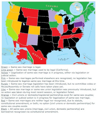
David Yale Mailloux (who maintains the excellent DYM SUM Blog) regularly updates this nicely color-coded map indicating the current status of same-sex couple recognition in the US and Europe. See the website for full explanation and notes.

Here's a snapshot of what the US map looks like (accessed July 9, 2009):


And here's Europe (accessed July 9, 2009):

The State News: Interactive Map

This interactive map at The State News derives its information from the NPR interactive map. Both maps strangely do not include California's domestic partnerships on the map (although if you click the NPR map it does indicate that domestic partnerships do exist in California).

This is The State News map (accessed July 8, 2009).

Monday, July 6, 2009

2010 Census: Counting Same Sex Couples (Pioneer Press)

A bit of tangent from the rest of the blog, but the Pioneer Press (Twin Cities, MN) ran this article with stats and a map concerning the changes that will occur in the US Census of 2010. The Census Bureau has said it will now count same-sex couples who report themselves as married.

Here's a snapshot of the map.

Sunday, July 5, 2009

Same Sex Marriages in Toronto (Toronto Star)

From the Toronto Star, an interesting feature: an article with charts and maps showing the distribution of same-sex couples in Toronto. This includes separate Google maps for female couples and male couples.

Here's a snapshot of map of female couples:

Here's a detail of the male couples map (you can scroll over each map for more information).


Monday, June 22, 2009

Tony Romm: Mapping Gay Marriage on Google Maps

Tony Romm has produced this cool map of same-sex marriage (same-sex couple recognition) in the US using Google Maps. It looks like a great start - although some corrections and updates are still required (accessed June 21, 2009).

I like the use of colors and clear legend - this is a screenshot:


Sunday, June 21, 2009

Same Sex Marriage in the USA: Greg Stoll Map

Greg Stoll has created this great map of same-sex marriage status in the USA. It bears the same red/green color scheme as the LA Times interactive chronology but this map provides more extensive and nicely color-coded information. Here's a screenshot of the main page (as of June 21, 2009):


Here's a projected view of how things will look by January 2010: